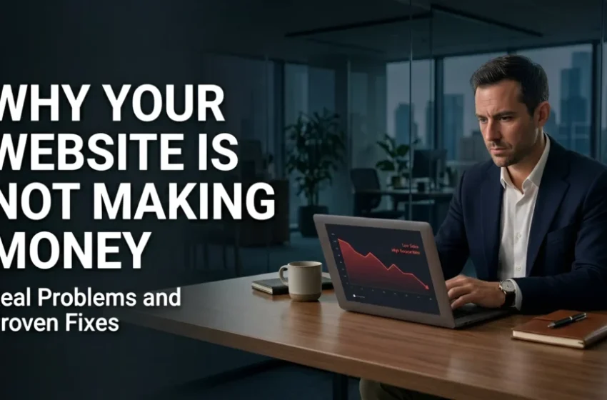
Discover the hidden mistakes that prevent visitors from becoming paying customers—and learn how to fix them.
Your Website Should Be an Investment, Not an Expense
Many business owners believe that simply having a website is enough to generate leads and sales. Unfortunately, that’s rarely the case.
A website can attract hundreds—or even thousands—of visitors each month and still fail to produce meaningful business results. If people are leaving without contacting you, requesting a quote, or making a purchase, your website isn’t doing its job.
The good news is that most conversion problems can be identified without hiring an expensive consultant. By reviewing a few key areas, you can uncover the issues that may be costing your business customers every single day.
This checklist will help you perform a basic audit of your website and identify the most common mistakes that reduce conversions.
1. Can Visitors Understand What You Do Within Five Seconds?
The first question every visitor asks is simple:
“Am I in the right place?”
If your homepage doesn’t answer that question immediately, many users will leave.
Ask yourself:
- Is your main headline clear?
- Does it explain exactly what your business offers?
- Can someone unfamiliar with your company understand your services instantly?
Poor Example
Building Digital Excellence
While it sounds professional, it doesn’t explain what the company actually does.
Better Example
Professional Website Design for Small Businesses That Want More Customers
Visitors immediately know:
- What the business offers
- Who it’s for
- What benefit they’ll receive
If visitors have to think, you’ve already lost valuable attention.
2. Is Your Navigation Simple and Intuitive?
Your navigation should help visitors—not confuse them.
Too many menu items create decision fatigue.
Common navigation mistakes include:
- 12–15 menu links
- Confusing page names
- Multiple dropdown levels
- Duplicate pages
- Hidden contact information
A clean navigation usually includes:
- Home
- Services
- Portfolio
- About
- Blog (optional)
- Contact
The easier it is to find information, the more likely visitors are to stay.
Self-Audit Checklist
✔ Can users reach any important page in one or two clicks?
✔ Are menu labels easy to understand?
✔ Is the Contact page always visible?
✔ Does the navigation work well on mobile devices?
3. Is Your Website Mobile-Friendly?
More than half of all website traffic now comes from smartphones and tablets.
If your mobile experience is frustrating, you’re losing customers before they even read your content.
Check your website on your own phone.
Ask yourself:
- Does everything fit the screen?
- Is the text readable?
- Are buttons easy to tap?
- Do images load correctly?
- Does the menu work smoothly?
Common mobile issues include:
- Tiny buttons
- Overlapping text
- Horizontal scrolling
- Slow-loading images
- Broken layouts
A responsive website isn’t optional anymore—it’s expected.
4. Does Your Website Load Quickly?
Speed directly affects both user experience and conversion rates.
Visitors expect pages to load almost instantly.
Slow websites create frustration, increase bounce rates, and reduce trust.
Common causes of slow performance include:
- Large image files
- Too many plugins
- Poor hosting
- Excessive animations
- Unoptimized code
Warning signs include:
- Images appearing slowly
- Delays before users can click buttons
- Pages taking several seconds to become interactive
Even a one- or two-second delay can reduce the number of inquiries and sales.
5. Is Your Call-to-Action Clear?
Every page should encourage visitors to take one obvious next step.
Unfortunately, many websites don’t.
Instead of guiding visitors, they simply provide information.
Ask yourself:
What do you actually want visitors to do?
Examples include:
- Request a Quote
- Book a Consultation
- Schedule a Demo
- Contact Sales
- Start a Free Trial
Your CTA button should be:
- Easy to notice
- Repeated throughout the page
- Action-oriented
- Visually distinctive
Avoid vague buttons like:
- Submit
- Learn More
- Continue
Visitors respond better when they understand exactly what will happen after clicking.
6. Are Your Contact Forms Too Complicated?
One of the biggest conversion killers is asking for too much information.
Many businesses unintentionally scare away potential customers with lengthy forms.
For a first inquiry, you usually need only:
- Name
- Phone (optional)
- Message
That’s it.
Avoid asking for:
- Company revenue
- Budget
- Address
- Job title
- Multiple dropdown selections
- Excessive required fields
Every additional field increases the chance that visitors abandon the form.
If possible, allow users to contact you through:
- Phone
- Live chat
- Contact form
Giving visitors multiple communication options increases conversions.
7. Do You Build Trust Immediately?
People rarely buy from businesses they don’t trust.
Your website should answer an important question:
“Why should I choose you?”
Trust signals include:
- Customer testimonials
- Google Reviews
- Case studies
- Before-and-after examples
- Certifications
- Awards
- Client logos
- Years in business
Specific achievements are far more persuasive than general claims.
Instead of saying:
We provide excellent service.
Say:
Over 700 completed projects with a 4.9-star average customer rating.
Numbers create credibility.
8. Is Your Content Focused on Customers Instead of Yourself?
Many websites talk too much about the company.
Visitors care more about solving their own problems.
Compare these examples.
Company-focused:
We have been in business for 15 years.
Customer-focused:
Our experience helps businesses launch websites that attract more qualified leads and increase sales.
The second example connects company experience directly to customer benefits.
Throughout your website, replace excessive “we” statements with language centered on the visitor.
9. Can Visitors Find Important Information Easily?
Customers shouldn’t have to search for basic information.
Your website should clearly display:
- Services
- Pricing (if applicable)
- Process
- Contact information
- Business hours
- Frequently asked questions
Hidden information creates uncertainty.
Uncertainty reduces conversions.
10. Are You Measuring Performance?
Many business owners don’t know whether their website is successful because they never track its performance.
Useful metrics include:
- Bounce rate
- Conversion rate
- Average session duration
- Contact form submissions
- Phone calls
- Quote requests
- Sales
Without analytics, you’re making decisions based on assumptions instead of data.
Even simple tracking tools can reveal where visitors leave your site and which pages generate the most inquiries.

Website Audit Checklist
Use this quick checklist to evaluate your website.
Homepage
✔ Clear headline explaining your business
✔ Strong value proposition
✔ Visible call-to-action
✔ Professional design
✔ Trust signals above the fold
Navigation
✔ Simple menu
✔ Easy-to-find Contact page
✔ Mobile-friendly navigation
✔ No unnecessary menu items
Performance
✔ Fast loading speed
✔ Responsive on all devices
✔ Optimized images
✔ No broken links
Conversion
✔ Simple contact form
✔ Clear CTA buttons
✔ Multiple contact options
✔ Customer-focused messaging
Trust
✔ Testimonials
✔ Reviews
✔ Client logos
✔ Portfolio or case studies
✔ Certifications or awards
Content
✔ Answers customer questions
✔ Easy to read
✔ Clear service descriptions
✔ Logical page structure

Final Thoughts
A website doesn’t fail because it looks outdated—it fails when it creates friction. Every confusing menu, slow-loading page, unclear message, or unnecessary form field adds another obstacle between your visitor and the action you want them to take.
The most effective business websites remove those obstacles. They communicate value immediately, guide users effortlessly, build trust through real proof, and make it simple to get in touch or make a purchase.
Take 20 minutes to review your website using this checklist. You don’t need to redesign everything overnight. Often, improving just a handful of key elements—such as simplifying navigation, shortening your contact form, clarifying your messaging, or strengthening your calls to action—can lead to a noticeable increase in leads and sales.
Remember, your website isn’t just an online brochure. It’s a digital salesperson that works around the clock. The better it serves your visitors, the better it will serve your business.