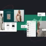
The anatomy of a high-converting landing page designed to turn paid traffic into customers.
Why Sending Paid Traffic to Your Homepage Is a Costly Mistake
Running Google Ads, Facebook Ads, Instagram campaigns, or LinkedIn promotions can drive a steady stream of visitors to your website—but traffic alone doesn’t generate sales. What matters is what happens after someone clicks your ad.
Many businesses make the mistake of directing paid traffic to their homepage. While a homepage is designed to introduce an entire company, a landing page has one specific purpose: convincing visitors to take a single action.
Whether you want users to request a quote, schedule a consultation, purchase a product, or download a guide, a dedicated landing page removes distractions and focuses entirely on conversion.
A well-designed landing page can significantly increase your conversion rate without increasing your advertising budget. In other words, you generate more leads and sales from the same number of clicks.
Let’s break down the anatomy of a landing page that consistently converts visitors into customers.
What Is a Landing Page?
A landing page is a standalone web page created specifically for a marketing or advertising campaign.
Unlike a traditional website page, a landing page focuses on one audience, one offer, and one call-to-action.
Its objective isn’t to educate visitors about every aspect of your business. Instead, it’s designed to answer one question:
“Why should I take action right now?”
Everything on the page should support that goal.
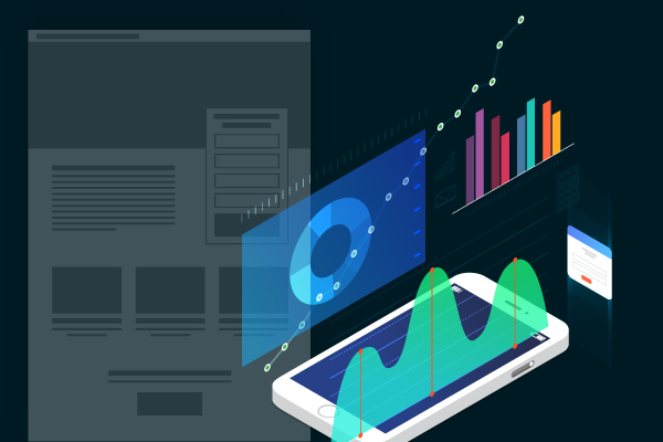
1. A Powerful Hero Section
The hero section is the first thing visitors see after clicking your advertisement.
Within just a few seconds, they should understand:
- What you’re offering
- Why it matters
- What they should do next
An effective hero section includes:
A Clear Headline
Avoid vague statements.
Poor example:
Innovative Solutions for Modern Businesses
Better example:
Custom Business Websites That Generate More Leads in 30 Days
The headline should communicate a clear benefit rather than simply describing your service.
A Supporting Subheadline
Expand on your promise by addressing the visitor’s problem.
Example:
We design fast, mobile-friendly websites optimized to convert visitors into paying customers.
A Strong Call-to-Action
Your CTA should stand out visually and encourage immediate action.
Examples:
- Get My Free Quote
- Schedule a Consultation
- Start Your Free Trial
- Claim Your Discount
The CTA should be visible without scrolling.
Relevant Visuals
Use professional product images, screenshots, mockups, or photographs that reinforce your offer.
Avoid generic stock photography whenever possible.
Real visuals create authenticity and trust.
2. Match the Message Between the Ad and the Landing Page
One of the biggest reasons landing pages fail is message mismatch.
Imagine your advertisement says:
Save 30% on Website Design This Month
But after clicking, visitors land on a generic homepage discussing your company history.
This disconnect creates confusion and increases bounce rates.
Instead, your landing page should repeat the same core message as the advertisement.
Maintain consistency in:
- Headlines
- Offers
- Pricing
- Visual style
- Tone of voice
Visitors should immediately recognize they’re in the right place.
3. Focus on Benefits, Not Features
Customers don’t buy products or services because of their features—they buy solutions to their problems.
Instead of listing technical specifications, explain the outcomes your customers will experience.
Feature
Mobile-responsive website.
Benefit
Your customers enjoy a seamless browsing experience on any device, increasing engagement and conversions.
Another example:
Feature
24-hour support.
Benefit
Get expert assistance whenever you need it, ensuring your business never misses an opportunity.
Throughout your landing page, ask yourself:
“Why does this matter to the customer?”
4. Build Trust Early
Visitors arriving from paid advertisements may have never heard of your business before.
You need to earn their trust quickly.
Include social proof near the top of the page.
Examples include:
- Customer testimonials
- Google Reviews
- Star ratings
- Client logos
- Industry certifications
- Awards
- Years of experience
- Projects completed
Strong testimonials are specific.
Weak example:
Great service.
Better example:
“Our online inquiries increased by 68% within two months after launching the new website.”
Specific results are far more persuasive than general praise.
5. Explain Your Offer Clearly
Never assume visitors understand your product or service.
Dedicate a section explaining:
- What you offer
- How it works
- Who it’s for
- Why it’s different
- What’s included
Use short paragraphs, icons, bullet points, and headings to make information easy to scan.
Visitors rarely read every word—they scan for answers.
6. Highlight Key Benefits
Instead of overwhelming visitors with dozens of selling points, focus on the biggest advantages.
For example:
Faster Results
Launch your website within days instead of weeks.
Higher Conversion Rates
Designed specifically to generate more inquiries and sales.
Mobile Optimization
Perfect performance across smartphones, tablets, and desktops.
SEO-Friendly Structure
Built with search engine visibility in mind from day one.
Each benefit should address a customer concern or desire.
7. Remove Friction from Your Contact Form
Your form should make it easy—not difficult—to become a lead.
Only ask for information you genuinely need.
A high-converting form often includes:
- Name
- Phone number (optional)
- Message
Avoid lengthy forms requiring:
- Company size
- Budget
- Address
- Multiple dropdown selections
- Unnecessary personal information
Every additional field creates another opportunity for visitors to leave without converting.
If possible, offer alternative contact methods such as:
- Phone
- Live chat
Different visitors prefer different communication channels.
8. Answer Common Objections
Even interested visitors have concerns.
Typical objections include:
- Is this trustworthy?
- Is it worth the investment?
- How long will it take?
- What happens after I contact you?
- Is there any risk?
Address these concerns before visitors ask.
Examples include:
Transparent Pricing
Explain what’s included.
Money-Back Guarantee
Reduce perceived risk.
Frequently Asked Questions
Answer the most common concerns.
Clear Process
Show exactly what happens after a customer submits the form.
Reducing uncertainty increases confidence.
9. Keep Navigation to a Minimum
Unlike a traditional website, a landing page should minimize distractions.
Avoid encouraging visitors to browse multiple pages.
Many successful landing pages remove:
- Large navigation menus
- Blog links
- Company history
- Unrelated services
- Footer navigation
Every unnecessary link creates another exit point.
Your goal is simple:
Keep visitors focused on the conversion action.
10. Optimize for Mobile Users
A large percentage of paid advertising traffic comes from smartphones.
Your landing page must perform flawlessly on smaller screens.
Check that:
- Text is readable
- Buttons are large enough to tap
- Forms are easy to complete
- Images scale correctly
- Loading speed is fast
Even a beautifully designed desktop page can fail if the mobile experience is frustrating.
Bonus: Create a Sense of Urgency
People are more likely to act when they believe they could miss an opportunity.
Ethical urgency can improve conversion rates.
Examples include:
- Limited-Time Offer
- Free Consultation This Month
- Discount Ends Friday
- Only 10 Appointments Available This Week
Avoid fake countdown timers or misleading scarcity tactics.
Authenticity builds long-term trust.
Landing Page Checklist
Before launching your advertising campaign, review this checklist.
Hero Section
✔ Clear headline
✔ Compelling subheadline
✔ Strong CTA button
✔ Relevant visuals
Trust
✔ Testimonials
✔ Reviews
✔ Client logos
✔ Certifications
✔ Success metrics
Content
✔ Benefits over features
✔ Clear explanation of the offer
✔ Simple page structure
✔ Easy-to-read formatting
Conversion
✔ Short contact form
✔ One primary CTA
✔ Multiple CTA placements
✔ Objection-handling section
Performance
✔ Fast loading speed
✔ Mobile optimization
✔ No broken links
✔ Message matches the advertisement
Final Thoughts
A successful advertising campaign doesn’t end when someone clicks your ad—that’s where the real work begins. Your landing page determines whether those clicks become leads, appointments, or sales.
The highest-converting landing pages share a common philosophy: they remove distractions, communicate value immediately, build trust quickly, and make taking action effortless. Every section, headline, image, and button should support a single conversion goal rather than competing for the visitor’s attention.
If you’re investing in paid advertising, your landing page deserves just as much attention as your campaigns. Even small improvements—such as a clearer headline, stronger social proof, a shorter contact form, or a more compelling call-to-action—can dramatically increase your conversion rate and lower your cost per lead.
Remember, successful landing pages aren’t about adding more content. They’re about presenting the right content, in the right order, with one clear objective: turning interested visitors into paying customers.